We apologize for any trouble connecting to the new site. Please visit and subscribe to our new blog, Open Book – Rare Books News.
New Name, New Address
21 Wednesday Aug 2013
Posted in Uncategorized

21 Wednesday Aug 2013
Posted in Uncategorized
We apologize for any trouble connecting to the new site. Please visit and subscribe to our new blog, Open Book – Rare Books News.
15 Thursday Aug 2013
Posted in Uncategorized
Thank you to all our followers. We invite you to join us at our new address under our new name OPEN BOOK – Rare Books News.
13 Tuesday Aug 2013
Posted in Uncategorized
Congratulations to Alesia, who, on Friday, received her official invitation to serve as a Peace Corps Volunteer in Ghana from February 2014 to April 2016. She will be working as a Health Educator in Ghana’s Health Program. Some of her primary duties will include: facilitating the process to bring clean water and sanitation facilities to communities, as well as promoting and improving existing facilities; increasing food security in Ghana through improving nutrition and food utilization in rural communities; teaching on topics such as hygiene, sexual reproductive health and family planning, HIV/AIDS, malaria, and diarrhea disease in schools, communities, or other settings; serving as an advocate for her adopted Ghanaian community for needed resources; and participating in a variety of other projects. Alesia graduated this past spring with a BS in Anthropology and a minor in International Studies; and an Honors BS in Biology with an emphasis in Cell and Molecular Biology and a minor in Chemistry. She has worked in the Rare Books Division since September 2009, the longest, by far, she says, that she has ever stayed with one job. Which means, of course, that she will miss us as much as we will miss her. She just doesn’t know it yet.
12 Monday Aug 2013
Posted in Book of the Week
Tags
astronomy, Copernicus, dialogo, Galileo, heliocentric, Index, Inquisition, Italian, Landini, Latin, mathematics, medicine, Padua, philosophy, Pisa, Ptolemaic, Roman Catholic Church, solar system, telescope, vernacular
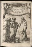
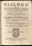
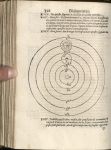
Dialogo Di Galileo Galilei Linceo Matematico Sopraordinario Dello Stvdio de Pisa
Galileo Galilei (1564-1642)
Fiorenza: Per Gio Batista Landini, 1632
First edition
Born in Pisa in 1564, Galileo studied medicine, mathematics, and philosophy. In 1592 he was appointed to the Chair of Mathematics in Padua. His early research was mainly on motion, particularly of falling bodies, but he became interested in astronomy. He developed a new type of telescope. Much of Galileo’s early work proved the theories of Copernicus, of which the Roman Catholic Church disapproved, placing an injunction not to hold or defend Copernican doctrine. Galileo ignored the injunction with the publication of Dialogo. Galileo’s Dialogo is a scientific and philosophical affirmation of the Copernican heliocentric theory over the earth-centered Ptolemaic theory of the solar system. Written in a literary style, Galileo deliberately chose to write this work in vernacular Italian rather than scholarly Latin in order to reach a mass audience. The topic made Galileo a threat to the authority of the Roman Catholic Church. It was this book that brought Galileo before the Inquisition in 1633, where he was forced to recant his views. He was put under permanent house arrest. Dialogo was placed on the Index of prohibited book where it remained until 1835. Publication took place between June 1631 and February 1632. The first printing numbered 1000 copies of 500 pages. This printing sold out before the end of September when it was banned by the Pope. Illustrated. University of Utah copy edges untrimmed.
05 Monday Aug 2013
Posted in Book of the Week
Tags
Aesop, copper, drafting film, etching, fables, George Fyler Townsend, goat vellum, Grafix, Joel Tabachnick, laser print, letterpress, line art, Mary Laird, Mohawk, Pergamom, Quelquefois Press, Samantha Hamady, Susi Schneider


Seven of Aesop’s Fables
Berkeley, CA: Quelquefois Press, 2008
Z239 Q39 A37 2008
Translation by Rev. George Fyler Townsend. From the colophon: “Samantha Hamady created the whimsical line art for the text. Joel Tabachnick coaxed the likes of an ancient copper box from an old etching plate in my closet. And I, Mary Laird, teamed up an ounce of my letterpress with a pound of alligator computer, to laser print this book on Mohawk 100 # text and Grafix drafting film. Susi Schneider gave me the goat vellum from Pergamom tanners which I used for the binding…” Edition of six copies. University of Utah copy is no. 4.
30 Tuesday Jul 2013
Posted in Online Exhibitions
Tags
Are We There Yet? Westward Exploration and Travel in North America
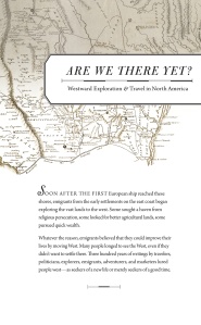
Are We There Yet?, 2012
29 Monday Jul 2013
Posted in Book of the Week


Fossil Ridge
Sue Cotter
S.l.: The Author, 1988
N7433.4 C6875 F6 1988
Handset type. Leaves hand cut, sewn in binding of handmade paper.
22 Monday Jul 2013
Posted in Book of the Week
Tags
Auerbach, Church of Jesus Christ of Latter-day Saints, Joseph Smith, LDS Centennial, pioneer, Utah
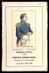
Exhibition of Relics of the Prophet Joseph Smith During the L.D.S. Centennial. April 5 to 12th, 1930 at the Auerbach co., Broadway at State, Salt Lake City
Salt Lake City, UT: Auerbach Co., 1930
From the title page: “The Auerbach Company, one of the pioneer institutions of Utah, is exhibiting this unique collection on the occasion of the Centenary Anniversary of the Church of Jesus Christ of Latter-day Saints.”
16 Tuesday Jul 2013
Posted in Book of the Week
Tags
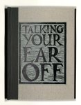
Talking Your Ear Off
Chris Collicott
Los Angeles, CA: C. Collicott, 1998
N7433.4 C647 T35 1998
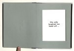
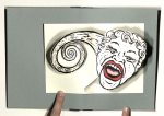
Folded pop-up cards mounted on blank pages. Edition of one hundred copies, signed and numbered. University of Utah copy is no. 55.
12 Friday Jul 2013
Posted in Courses
Tags
artists' books, book arts, Book Arts Studio, bookbinding, creative writing, English, letterpress, Marriott Library, moveable type, rare books
Introduction to Creative Writing with Book Arts
THIS MEDIUM SPECIFIC APPROACH to creative writing introduces
emerging writers to the techniques and craft of inventive
writing as well as book arts. Students will consider the
generative process as a performance within a medium
and how the interplay of form and content operate within
the physics of that medium. The course includes six visits
to the Book Arts Studio at the Marriott Library, during
which students will view artists’ books from Rare Books,
get hands-on experience with bookbinding and letterpress
printing from moveable type, and collaborate to produce
a limited-edition book, of which every participant will
receive a copy. As a variation on the final portfolio, students
will be encouraged to produce chapbooks for their final
projects. In both the studio and classroom, we will ask:
What is a book? How might a book’s shape transfigure its
meaning? How do typographic decisions affect creative
texts? What is a creative text? No prior experience in the
book arts or imaginative writing is required.
